Kidakins
274 Watchers326 Deviations
85.8K
PageviewsCollections

All
41341 deviations
Featured
28060 deviations
feat. my characters
182 deviations
my beebs
63 deviations

see you around kiddos
87 deviations
3d art
163 deviations
animals
413 deviations

animation
140 deviations

anthro
1199 deviations

bases
37 deviations

brushes - csp
1 deviation

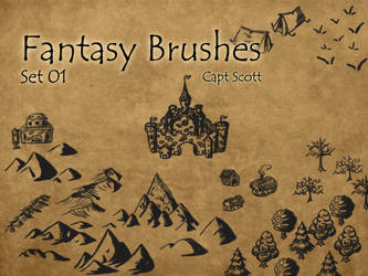
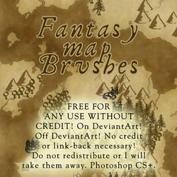
brushes - ps
187 deviations
brushes - sai
30 deviations
brushes - sai2
12 deviations

- closed species
25 deviations

-- cervibis
8 deviations

-- dracostryx
1257 deviations

-- fumis
51 deviations

-- grem2
42 deviations

-- kiamaras
46 deviations

-- kukuris
67 deviations

-- MTTs
57 deviations

-- reos
18 deviations
-- tokotas
34 deviations
comics to read
6 deviations

comics
145 deviations
commission prices
90 deviations
cosplay
22 deviations

creatures
122 deviations

css
54 deviations
designs
443 deviations
dinosaurs
52 deviations
dragons
1479 deviations
dragons - flight rising
22 deviations

environments
105 deviations

- fanart
22 deviations
- fanart - games
240 deviations

- fanart - movies tv
280 deviations

-- fanart - pokemon
124 deviations
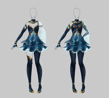
fashion
4 deviations

fonts
68 deviations
funnies
90 deviations
humanoid
165 deviations
improvement
66 deviations

jewelry
19 deviations
mini PSA: colors and contrast in BGs
this has been mentioned in many background tutorials, but I figure it couldn't hurt to spread a bit of friendly advice since a lot of my watchers watched me for my pixel BGs!
a friend pointed this out to me a while ago and my BGs have improved by about 200% since i got more serious about watching my values and contrast
like, look at these old BGs. they look okay, except they're about 90% comprised of "the mid-tones of meh". the dark areas are not very dark, and the light areas that should be standing out are getting lost.
then compare these BGs:
wow, much contrast, so drama! the areas of light and dark are well-defined. aspects of the pie
journals
236 deviations
Literature
My Confession
I firmly believe that love is the answer.
literature
10 deviations
![[SFM] Flying to the future](https://images-wixmp-ed30a86b8c4ca887773594c2.wixmp.com/f/5dd6bce6-6cf3-4fca-84f3-dcc0fb4ed07b/d9n4hg3-0513bc17-c7ad-4f95-a0cd-82015fc254dc.jpg/v1/fill/w_300,h_169,q_70,strp/_sfm__flying_to_the_future_by_herrdoktorhans_d9n4hg3-200h.jpg?token=eyJ0eXAiOiJKV1QiLCJhbGciOiJIUzI1NiJ9.eyJzdWIiOiJ1cm46YXBwOjdlMGQxODg5ODIyNjQzNzNhNWYwZDQxNWVhMGQyNmUwIiwiaXNzIjoidXJuOmFwcDo3ZTBkMTg4OTgyMjY0MzczYTVmMGQ0MTVlYTBkMjZlMCIsIm9iaiI6W1t7ImhlaWdodCI6Ijw9NDMyMCIsInBhdGgiOiJcL2ZcLzVkZDZiY2U2LTZjZjMtNGZjYS04NGYzLWRjYzBmYjRlZDA3YlwvZDluNGhnMy0wNTEzYmMxNy1jN2FkLTRmOTUtYTBjZC04MjAxNWZjMjU0ZGMuanBnIiwid2lkdGgiOiI8PTc2ODAifV1dLCJhdWQiOlsidXJuOnNlcnZpY2U6aW1hZ2Uub3BlcmF0aW9ucyJdfQ.VizNLgSfws4yIwWA0SfCVJaaucfbayfaHexm478iuco)
other
15 deviations
page decor
30 deviations

photography
565 deviations

pixel art
122 deviations